Chi Vo

I turn complex data and reporting into clear, visual stories and interactive experiences that people actually read and engage with.

Currently at The Straits Times, Singapore
Data & Code: Python, R, Clustering, NLP, Web Scraping, Flask, OCR, Geospatial Analysis
Web & Viz: D3.js, React, Tailwind, Leaflet.js, HTML/CSS/JS, Scrollytelling, Interactive Mapping
Design & UX: Adobe Suite (Illustrator, Photoshop, InDesign, Premiere Pro, After Effects, XD), Figma, Infographics, Design Systems, Wireframing, Visual Storytelling
Racial Equity in Lending Was a Promise

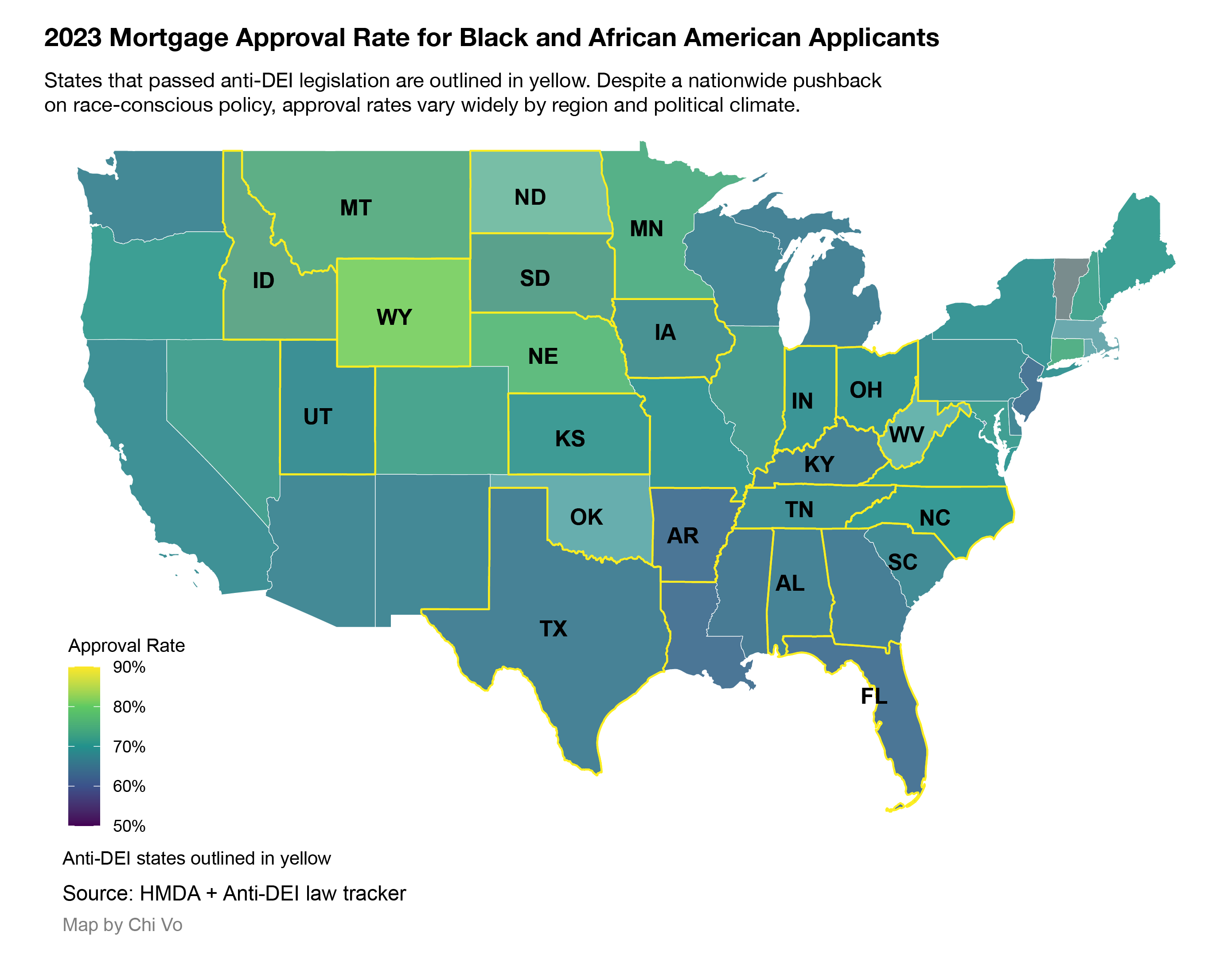
Racial Equity in Lending Was a Promise. It Didn't Last.

A data-driven investigation into how U.S. banks' 2020 racial-equity pledges quietly receded, combining 15M HMDA records, annual reports, and policy shifts to reveal persistent mortgage approval gaps. Duration: Two months
Mortgage Data • HMDA • Regression • Data Cleaning • R • Python • Policy Analysis • Banking • Civil Rights • Annual Reports • Illustrator • Writing • Scrollytelling

The thrill lasts seconds, the trash lasts forever

The thrill lasts seconds, the trash lasts forever

An immersive visual investigation into the billion-dollar blind box craze, revealing how dopamine-driven collecting culture fuels waste, gambling-like behaviour, and throwaway consumerism through data, probability modelling, and interactive storytelling. Published: The Straits Times
Journalist • Creative Direction • Scrollytelling • Interactive Calculator • Probability Modeling • Google Trends • Consumer Psychology • Environmental Reporting • Waste Analysis • Data Reporting • Writing • Project Management

How many ways can you pay in Singapore?

How many ways can you pay in Singapore?

A visual explainer on Singapore’s evolving payment habits, showing how digital convenience, rewards ecosystems, and lingering cash culture shape the way people spend across transport, hawker centres, groceries, and online life. Published: The Straits Times
Duration: Two weeks
Designer • Data Visualization • Survey Data • Consumer Behavior • Payment Systems • Financial Explainer • Bar Charts • UI Layout • Mobile Graphics • News Graphics

The Bank That Robbed Itself

The Bank That Robbed Itself

Visual timeline and diagrams breaking down Vietnam's largest bank fraud. Investigated how $44B vanished through fake loans and shell firms. Duration: Two weeks
Storytelling • Illustration • Financial Analysis • Fraud Reporting • Corporate Networks • Timeline Design • Diagramming • Research • Editorial Design

NYC Mayoral Election Map

How Every Block Voted in the N.Y.C. Mayoral Primary

Interactive precinct-level map showing certified first-round results of the Democratic primary's ranked-choice vote, with detailed breakdowns by neighborhood and candidate performance. Duration: Two weeks
Interactive Mapping • Election Data • Ranked-Choice Voting • Precinct Data • D3.js • GeoJSON • Geospatial Analysis • Data Visualization • Mobile Friendly

Brewed, Branded, and Beige

Brewed, Branded, and Beige

Mapped the aesthetics and urban logic of 5,000+ cafés across 90 cities using AI vision, geospatial joins, and regression. Duration: Three weeks
Web Scraping • Playwright • BeautifulSoup • OCR • Translation • AI Captioning • BLIP • OWL-ViT • FASTopic • Geocoding • KML • Census Data • Logistic Regression • Mapping • Design

Mercury's Literary Legacy

Mercury's Literary Legacy

Explored cultural bias in planetary naming. Scraped crater names, traced gender/ethnicity, and visualized global artistic legacy in space. Duration: One week
Web Scraping • Data Cleaning • Cultural Data • Gender Analysis • Ethnicity Research • Google Sheets • Illustrator • Data Visualization • Writing

Street view

Uptown's Dangerous Intersections: Can Technology Curtail Collisions?

Mapped 4,500+ collisions across Upper Manhattan using NYC Open Data and interviewed AI researchers on tech-led traffic safety. Duration: Two weeks
Investigative Reporting • NYC Open Data • Crash Data • Geospatial Analysis • Traffic Safety • AI Policy • Interviewing • Urban Infrastructure • Local Reporting

map of USA

The Hidden Shift in Black Home Loans

Even as banks made racial equity pledges after George Floyd's murder, our analysis of 15 million mortgage applications shows that political shifts, anti-DEI laws, and the rollback of legal tools like disparate impact threaten to quietly entrench racial disparities in home lending. Duration: Ongoing
Mortgage Data • HMDA • Regression • Data Cleaning • R • Python • Fair Lending • Anti-DEI Policy • Disparate Impact • Interviewing • Illustrator • Writing

sentiment analysis of companion app

Loneliness and Liability: The Risks of Emotional Bonds with AI

Tested 5 AI companionship apps against suicide response standards; uncovered major safety failures and ethical blind spots. Duration: One month
AI Safety • Research • Rubric Building • Testing Framework • Companion Apps • Suicide Response Standards • Policy Reporting • Sentiment Analysis • Editorial Writing

NYC free wifi

Recipe for a good joke

Analyzed 2,000+ human and AI-generated captions using embeddings, clustering, and humor trait labeling to decode what makes jokes work. Duration: Ongoing
NLP • Embeddings • Clustering • Zero-Shot Classification • Humor Theory • Human-AI Comparison • D3.js • Scrollytelling • Data Visualization

Broken Promises of Peace

Broken Promises of Peace

Built a React timeline exploring 300+ conflicts to test whether peace treaties actually end war. Duration: Two weeks
Data Analysis • Conflict Data • Peace Treaties • UCDP • Timeline Design • React • Tailwind • Visual Design • Writing

NYC free wifi

Free WiFi in NYC search

Mapped 3,000+ public Wi-Fi hotspots across NYC using cleaned open data and interactive search powered by Leaflet.js. Duration: One week
Data Cleaning • Leaflet.js • JavaScript • HTML/CSS • Front-End Mapping • Search Interface • NYC Open Data • Geolocation • Civic Data

NYC Community Boards Scraper

NYC Community Boards Scraper

Built a Flask app that scrapes, parses, and centralizes 200+ PDF minutes from NYC community boards to support local journalism. Duration: Ongoing
Web Scraping • PDF Parsing • Flask • pdfplumber • HTML/CSS • Civic Data • Automation • Local Government • Database Design

Past life as a visual designer

Commercial Work and Personal Projects

From AI to policy to food, data visualization, UI, and editorial design.
Duration: Five years
Visual Storytelling • Data Visualization • UI Design • Editorial Design • Infographics • Branding • Adobe Illustrator • Photoshop • InDesign • Premiere Pro • After Effects • Flourish • Adobe XD • Figma • Inkscape • Excel

Inspire Design App

Inspire

Collaboration with Abbey Wang. 'Inspire' is a tablet app designed to bridge the gap between a user's goal of becoming a designer and their current skill level. Connect students to mentors, activities, and design disciplines. Adobe Creative Jam Top 10% projects 2020 (Worldwide) • Duration: 2 days
UX/UI Design • Mobile App Design • Wireframing • Design Systems • User Research • Mentorship Product • Prototyping • Adobe XD
Role: Designer

Scottish Fiscal Commission Design System

Scottish Fiscal Commission Design System

Revamped website and launched comprehensive infographics summary design system for economic forecasts, fiscal overviews, and tax analysis. System still in use today across all publications and social media. Duration: October 2021 - June 2022
Web Accessibility • Design Systems • Infographics • Social Media Templates • Economic Forecasts • Fiscal Data • Tax Analysis • Economic Data Visualization
Role: Designer
Shipped: May 2022